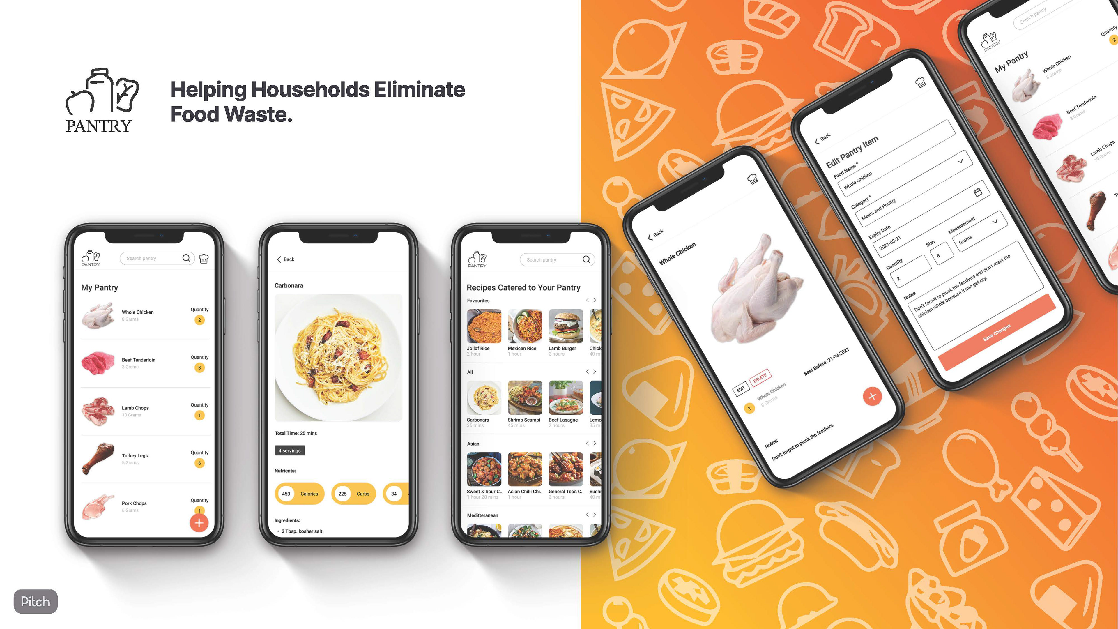
Pantry Web App

Overview:
Collaborated with a Product Manager and Developer in order to design and create a live comprehensive web application product to help households eliminate food wastage and use up what they already have through recipes catered to their pantry.
Tools Used:
Figma
Adobe Illustrator
Adobe Photoshop
Role:
User Experience Designer
User Interface Designer
User Researcher
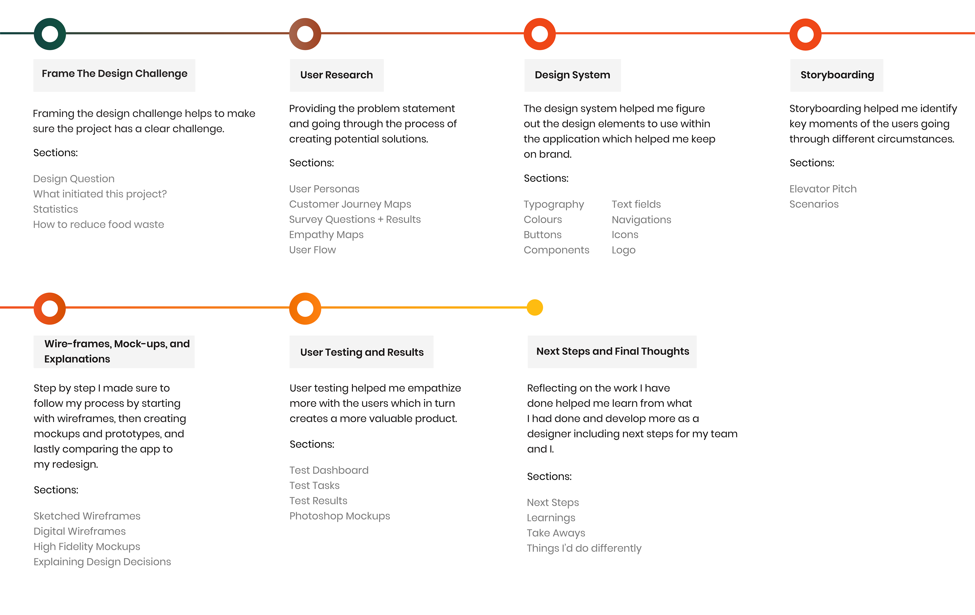
Design Process:
I go through an extensive design process in order for me to create the best possible solution. Feel free to refer to this before taking a look at my process.
Framing the Design Challenge:
Framing the design challenge helps to make sure the project has a clear challenge.
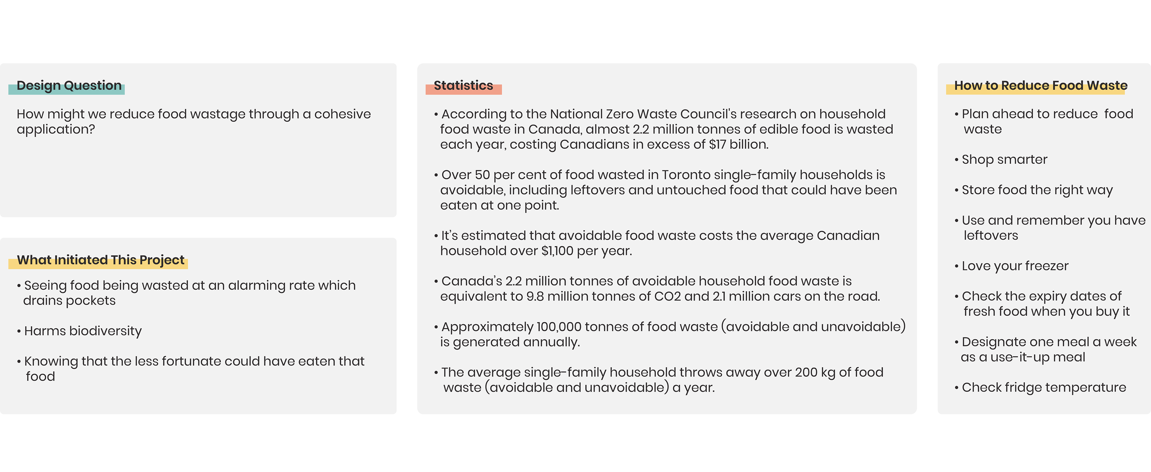
Findings Overview:
The main findings from doing this analysis were that a ton of food was going to waste increasingly in the US and Canada. Through research, it was identified that there are a few key steps to keep households clear of food waste because as you can see the numbers are astonishing.
User Research:
Doing research helped me hone in on the problems that the intended demographic were having, in order for me to create the best possible web app for the solution.
User Personas:
The persona was used to help me stay anchored on the user's behaviours, and avoid letting desires for features trump user needs.
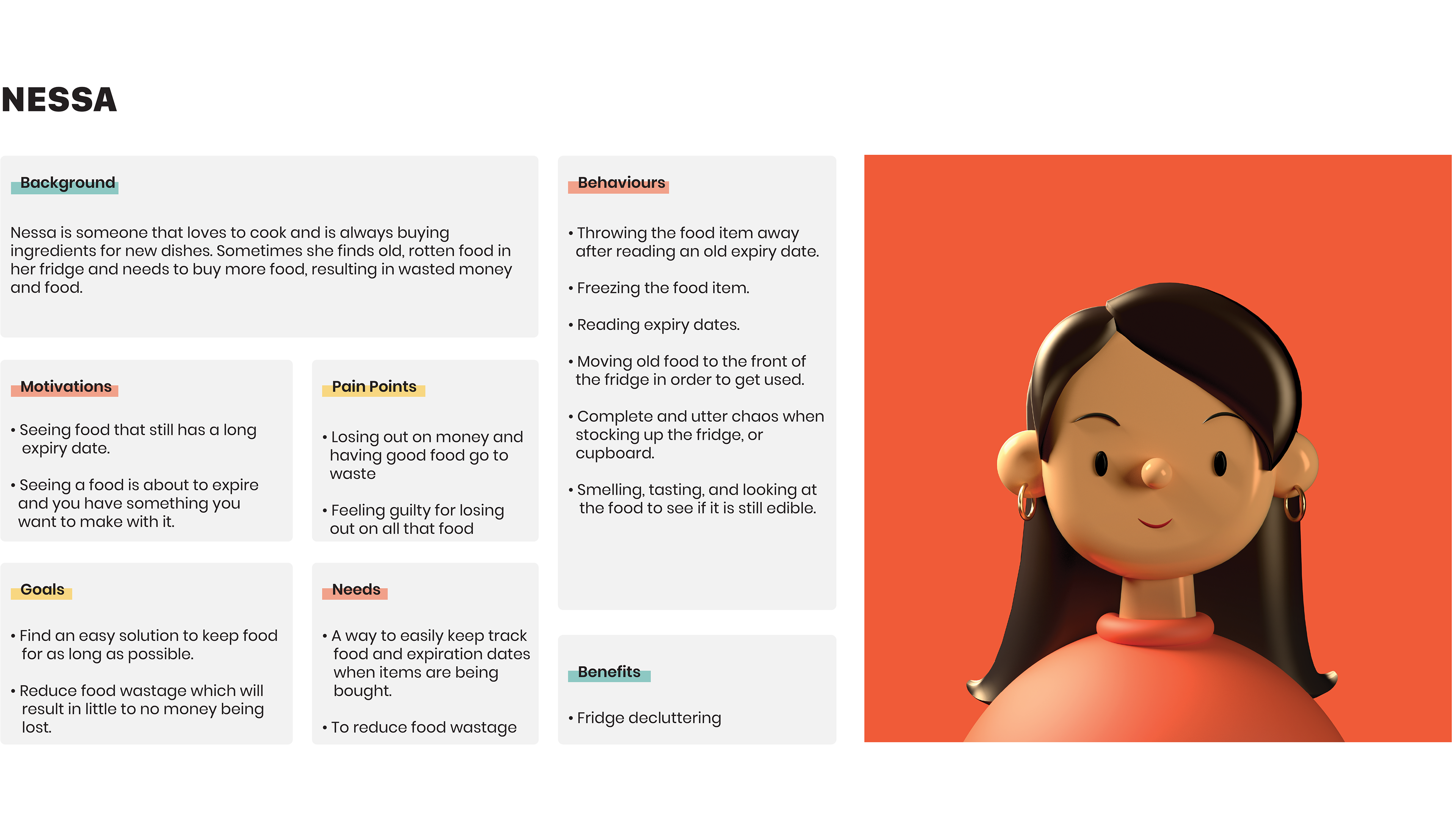
Nessa's Persona Overview:
Background: Nessa is someone who loves cooking has wastage issues.
Motivations: Nessa is motivated to cook food that is about to go bad.
Behaviours: Nessa throws away bad food, freezes food to last longer.
Benefits: Nessa declutters the fridge to make more room for new food.
Goals: Nessa's goal is to find ways to store food longer
Pain Points: Nessa hates when she loses money, it makes her guilty.
Needs: Nessa needs a way to track her foods best before dates.
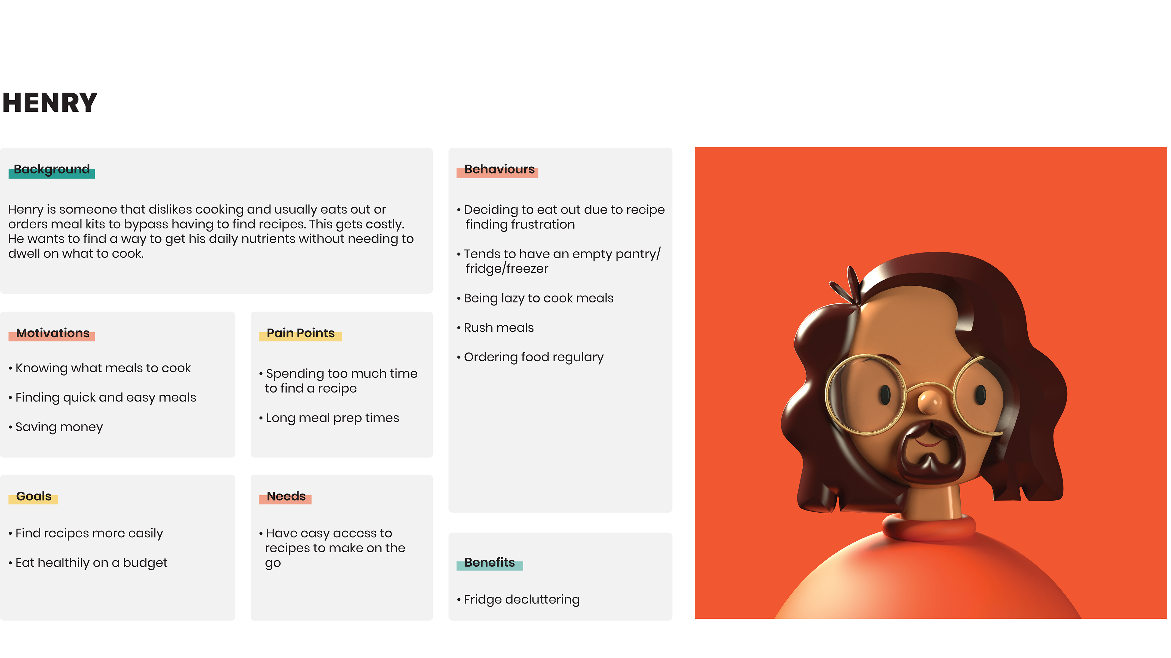
Henry's Persona Overview:
Background: Henry dislikes cooking and eats out to avoid finding recipes.
Motivations: Henry is motivated when he knows what to cook.
Behaviours: Henry eats out a lot, barely has food, and is lazy about cooking.
Benefits: Henry gets to declutter his fridge.
Goals: Henry's goal is to find healthy recipes on a budget.
Pain Points: Henry hates making time-consuming meals.
Needs: Henry needs easy and quick meals to make.
Customer Journey Maps:
The journey maps visualized the process that the users could go through in order to accomplish a goal before and after the web app is created.
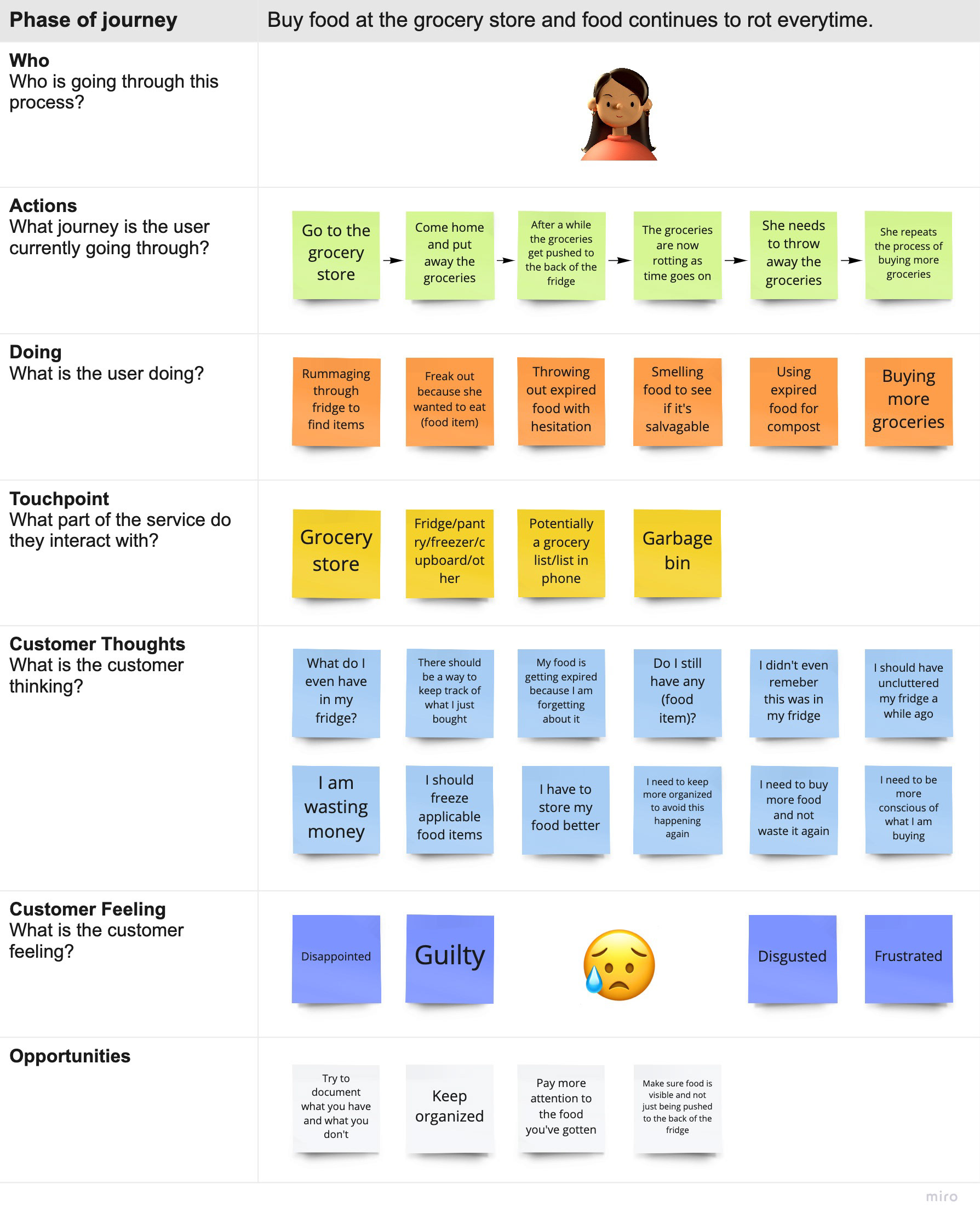
As-Is:
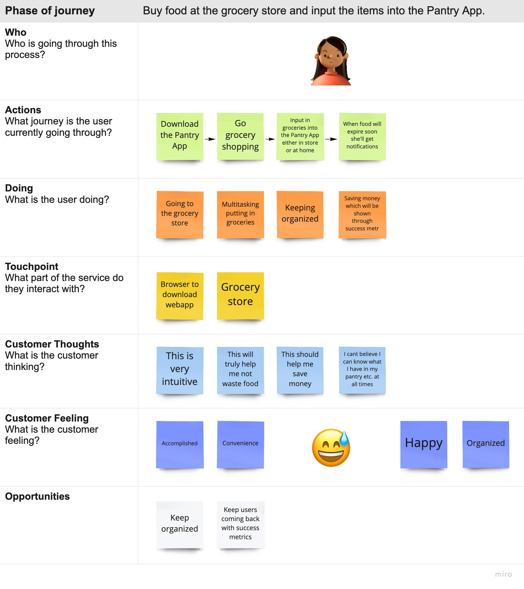
To Be:
Nessa's Map Overview:
You'll find that the process is a lot more optimized with the web application. When the web app is not in use she would most likely be put into the cycle of food getting wasted whereas, with the web app, she would see a full view of her pantry and get notifications when food expires soon from anywhere.
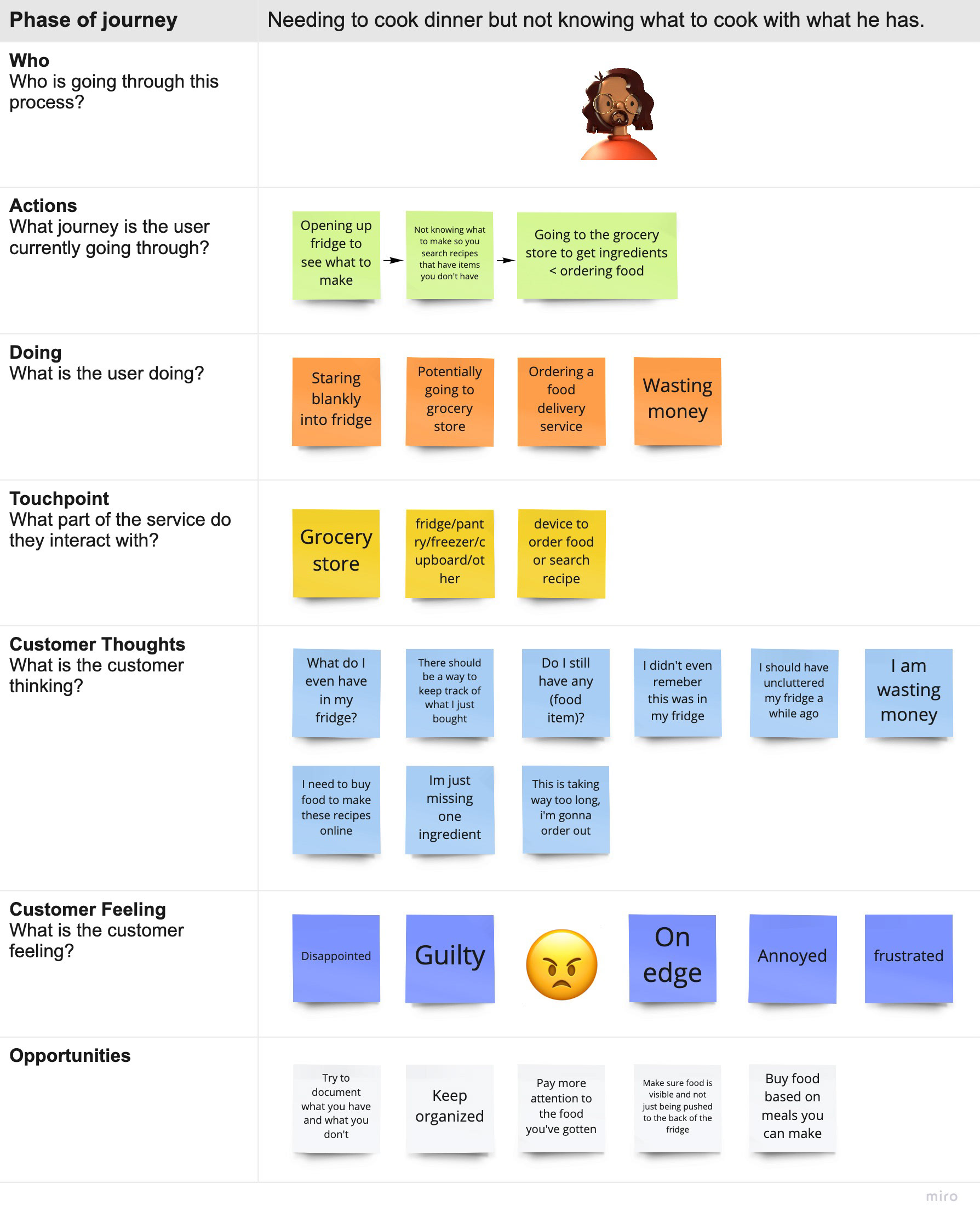
As-is:
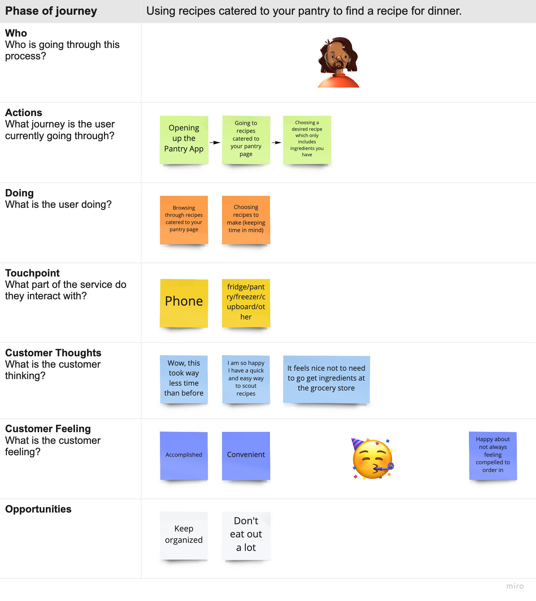
To Be:
Henry's Journey Map Overview:
The web application creates ease when it comes to finding quick recipes. Without the web app, he would waste time searching for recipes with ingredients he probably does not have. This would take forever. Ultimately the web app would optimize the process of choosing a meal to cook. The process is much more favourable with the web app than without.
Survey:
Questions:
Q1: How old are you?
Q7: When you do cook, how do you decide what to make?
Q2: How often do you grocery shop?
Q8: What is the most amount of time you want to spend cooking?
Q3: How much do you spend on groceries a week?
Q9: Have you ever used a meal recipe service?
Q4: After grocery shopping, how much food typically goes bad?
Q10: Are you still using one of these services, if not why?
Q5: When you are hungry, do you mainly cook or eat out?
Q6: If you are not cooking, what is stopping you?
Results:
Here you will see a spreadsheet with a series of questions we asked our target audience.
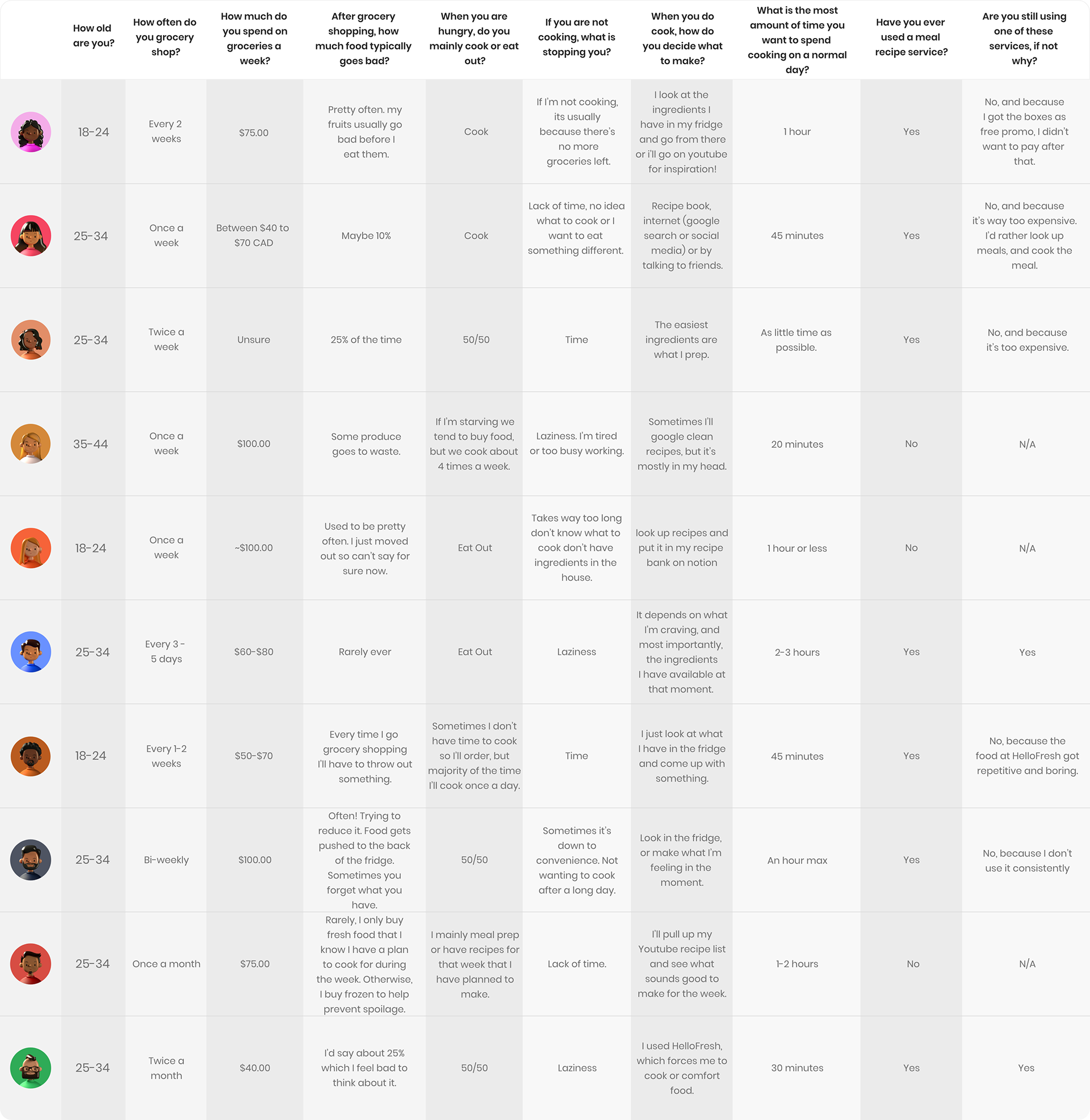
Findings Overview:
As you'll see, there is a large pattern of time being the issue when it comes to cooking, and it was mentioned a lot that meals come from using what they have more often than what they don't have.
Empathy Maps:
Next, you'll see a chart that groups certain behaviours our users have when food is going to waste.
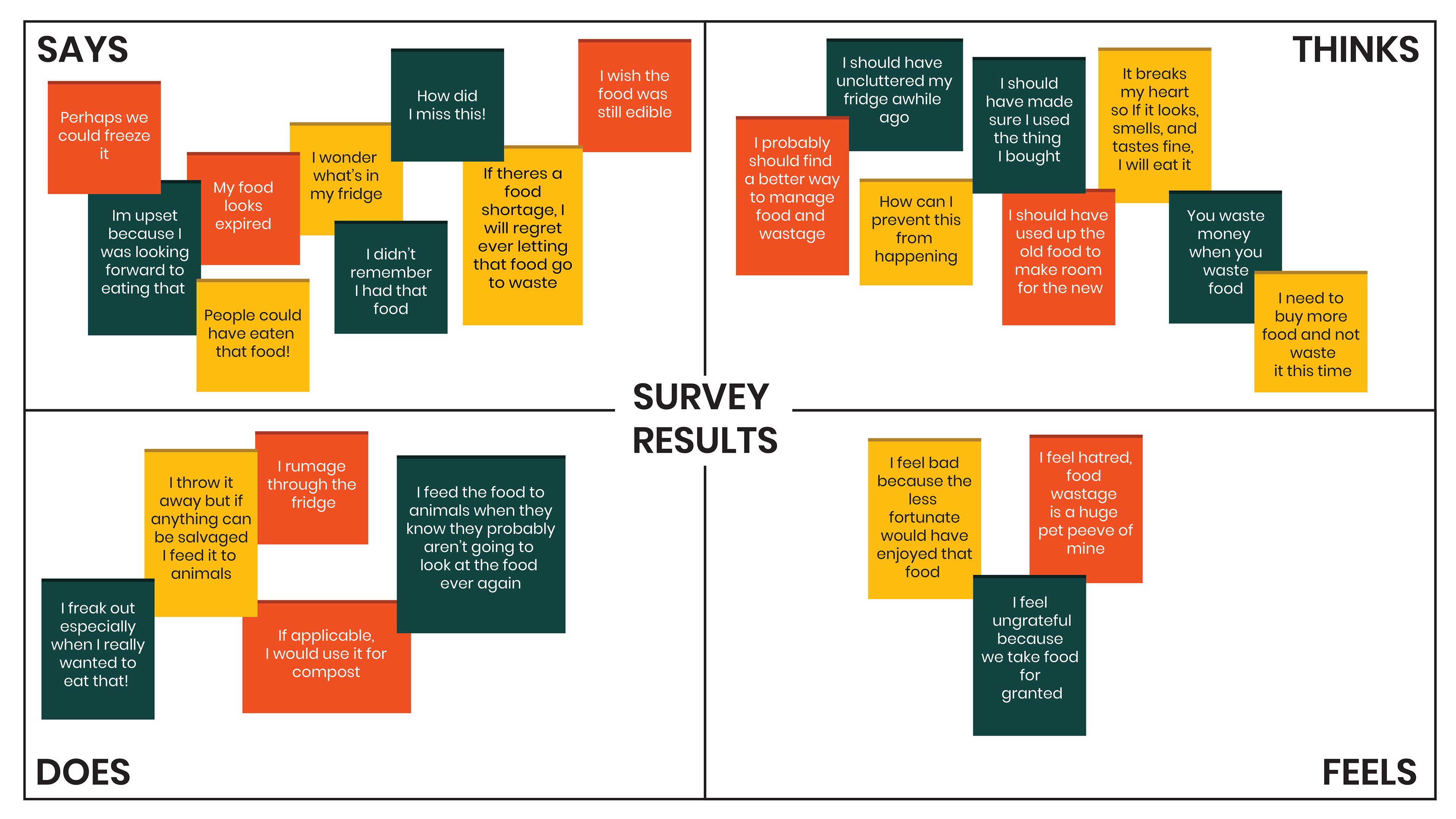
Findings Overview:
There's a strong result of both solutions and also frustration and regret. As you can see, most results come from the "says" and "thinks" sections. That's because there isn't a lot of things to do and feel. It's pretty much just throwing away, or reusing the food for other purposes, and feeling horrible about the food going to waste.
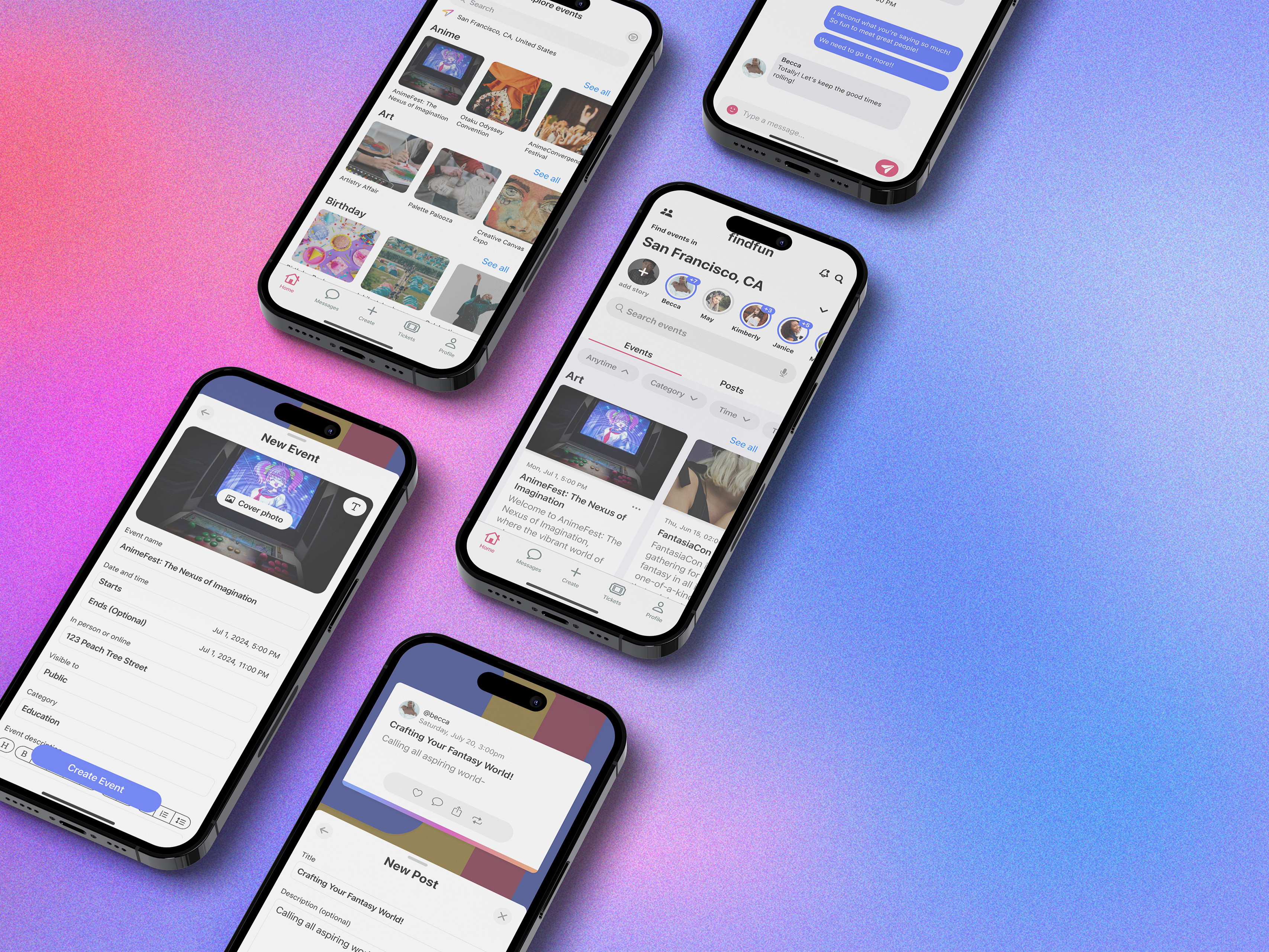
User Flow:
A user flow helped identify key actions within the web app, and the screens to focus on first.
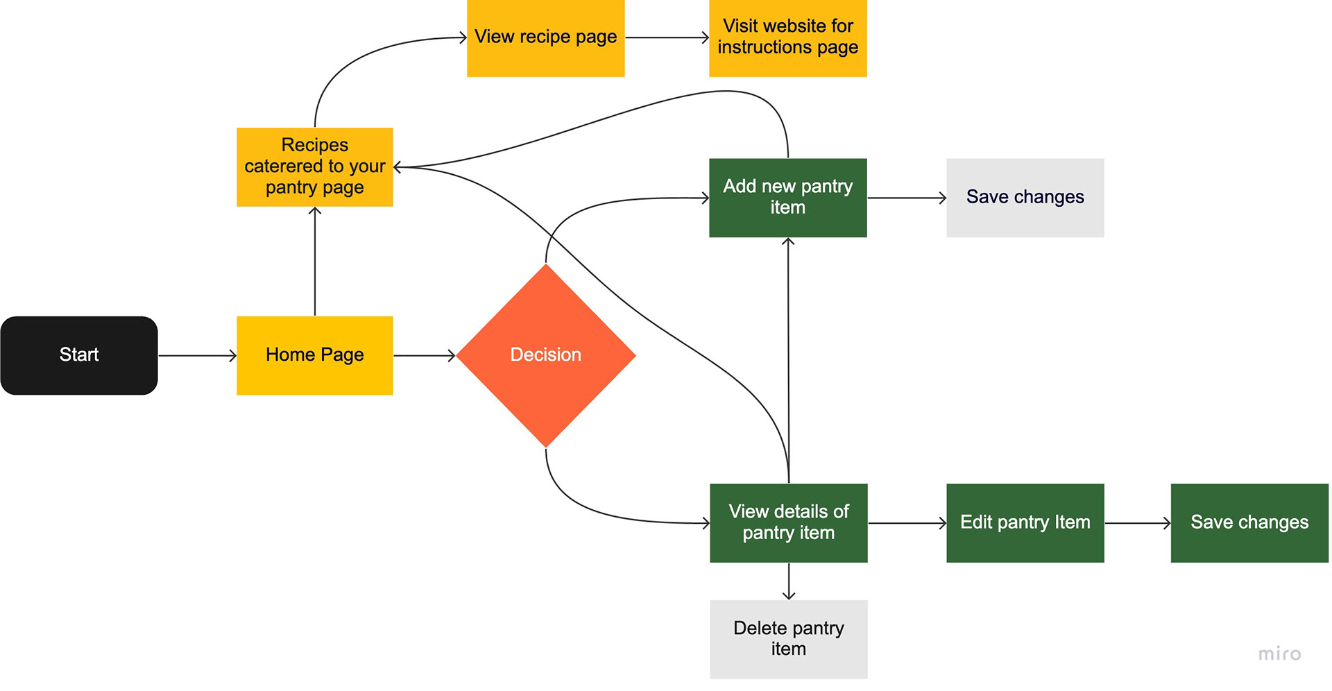
Overview:
The user flow process is a simple and easy process. The user first starts off on the homepage where they can either see their pantry items, add an item, or get recipes catered to their pantry. There are also some micro-interactions such as saving changes and deleting items.
Design System:
The design system helped me figure out the design elements to use within the web app which helped me keep on brand.
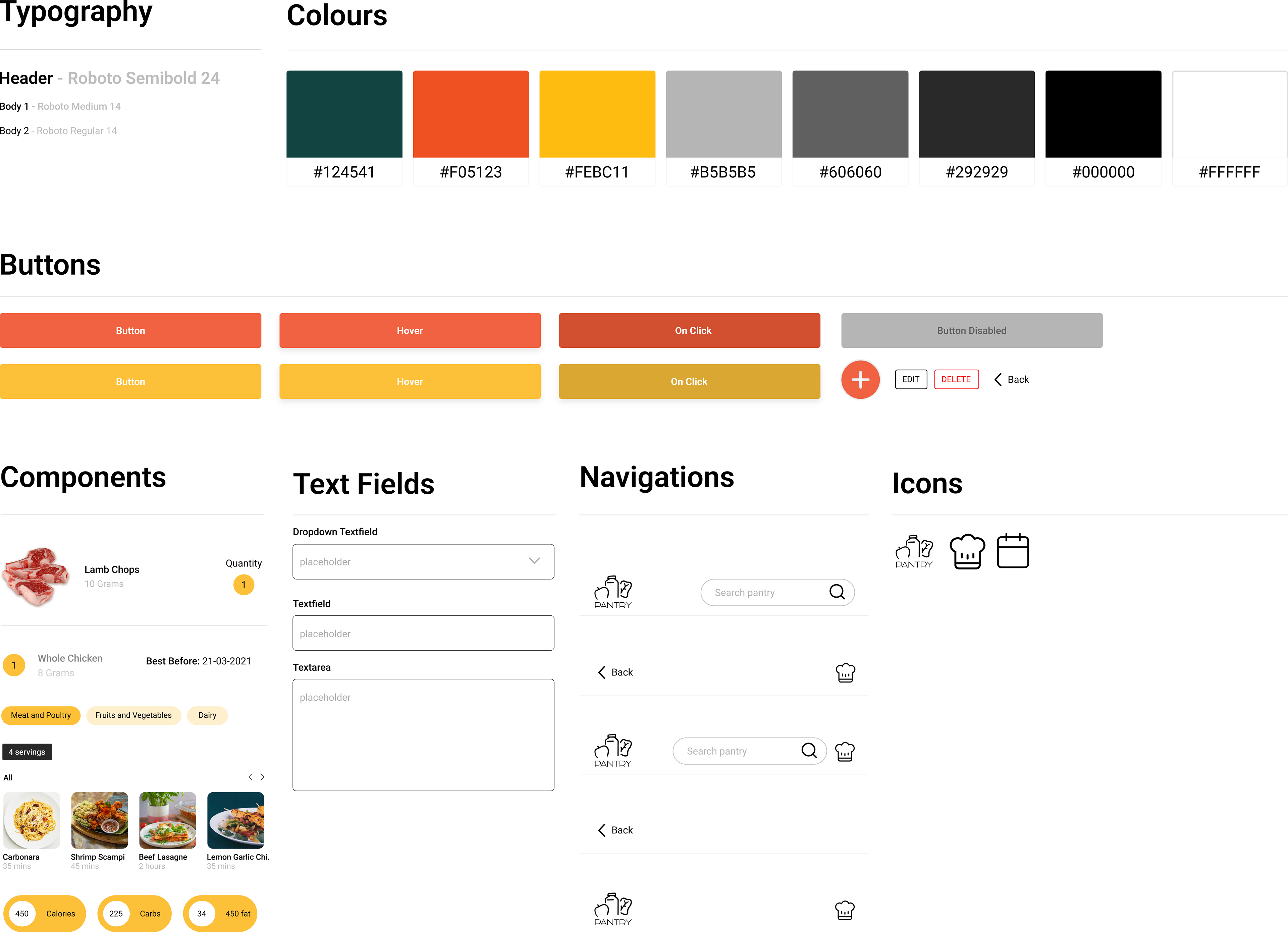
Overview:
In terms of the bright colours, I wanted to use colours that are much associated with food web apps and encourage hunger.
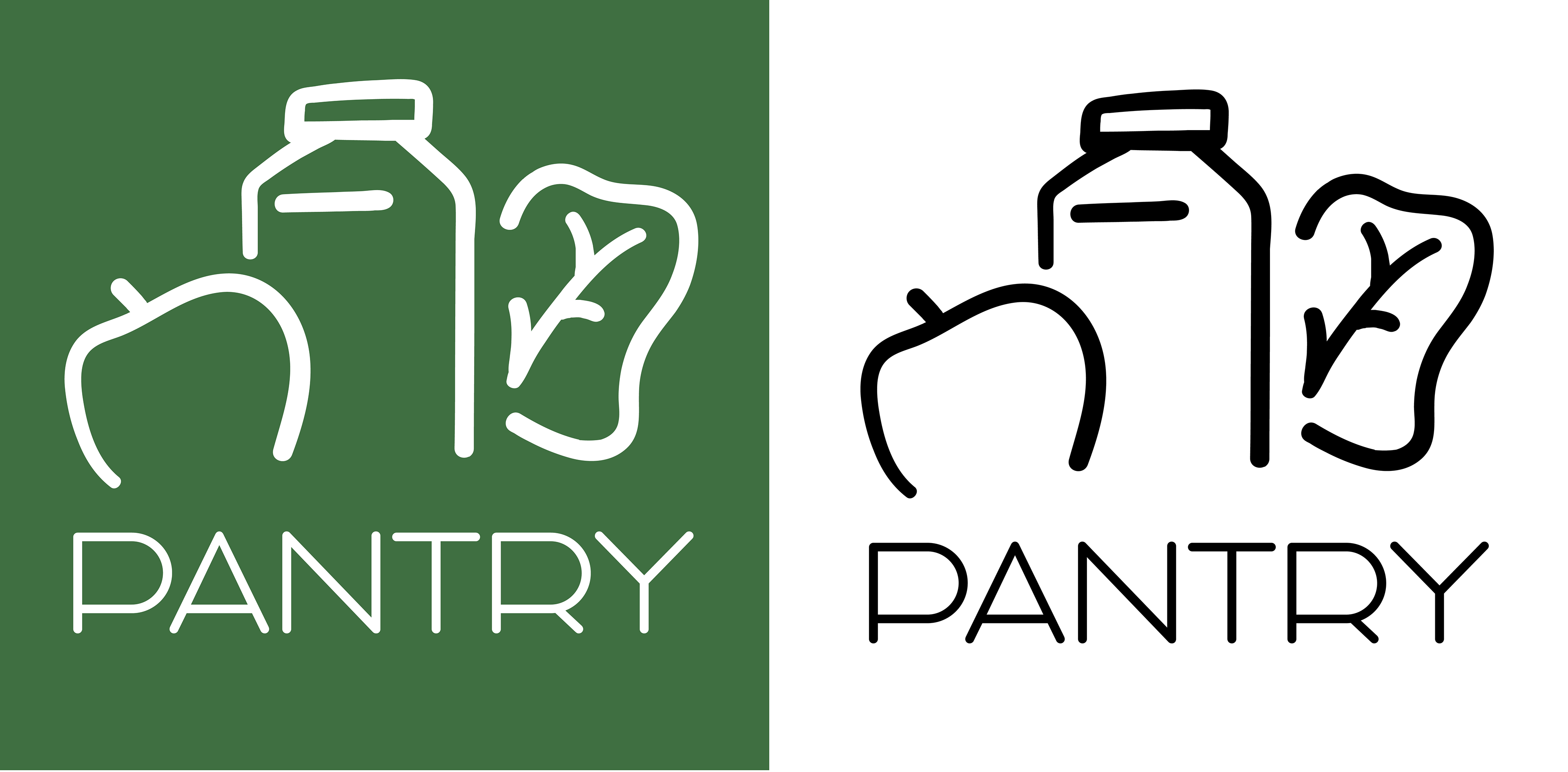
Logo Design:
I wanted the logo to be very food-friendly looking. The colours are nice and bright and incite healthy food choices.
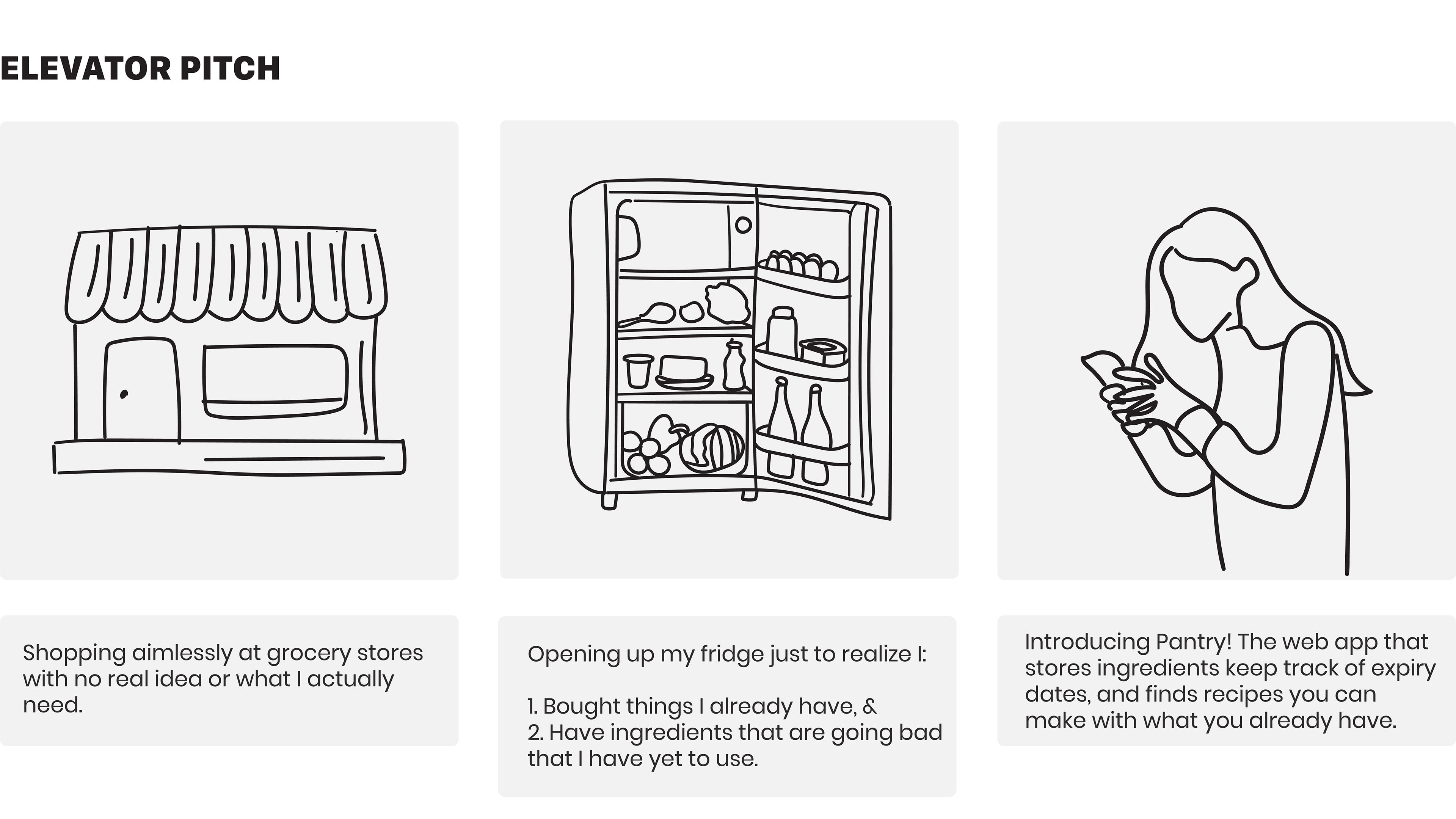
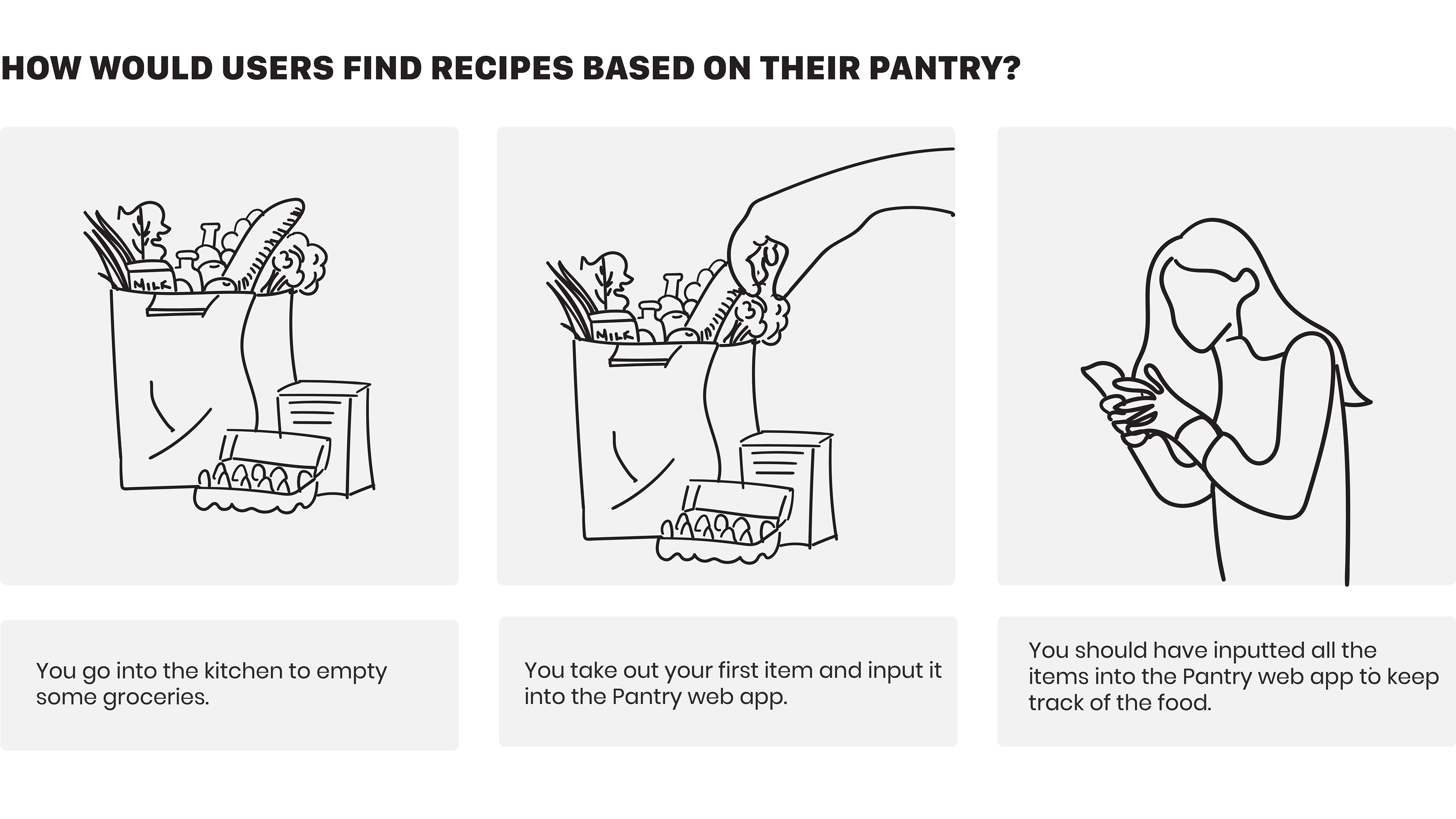
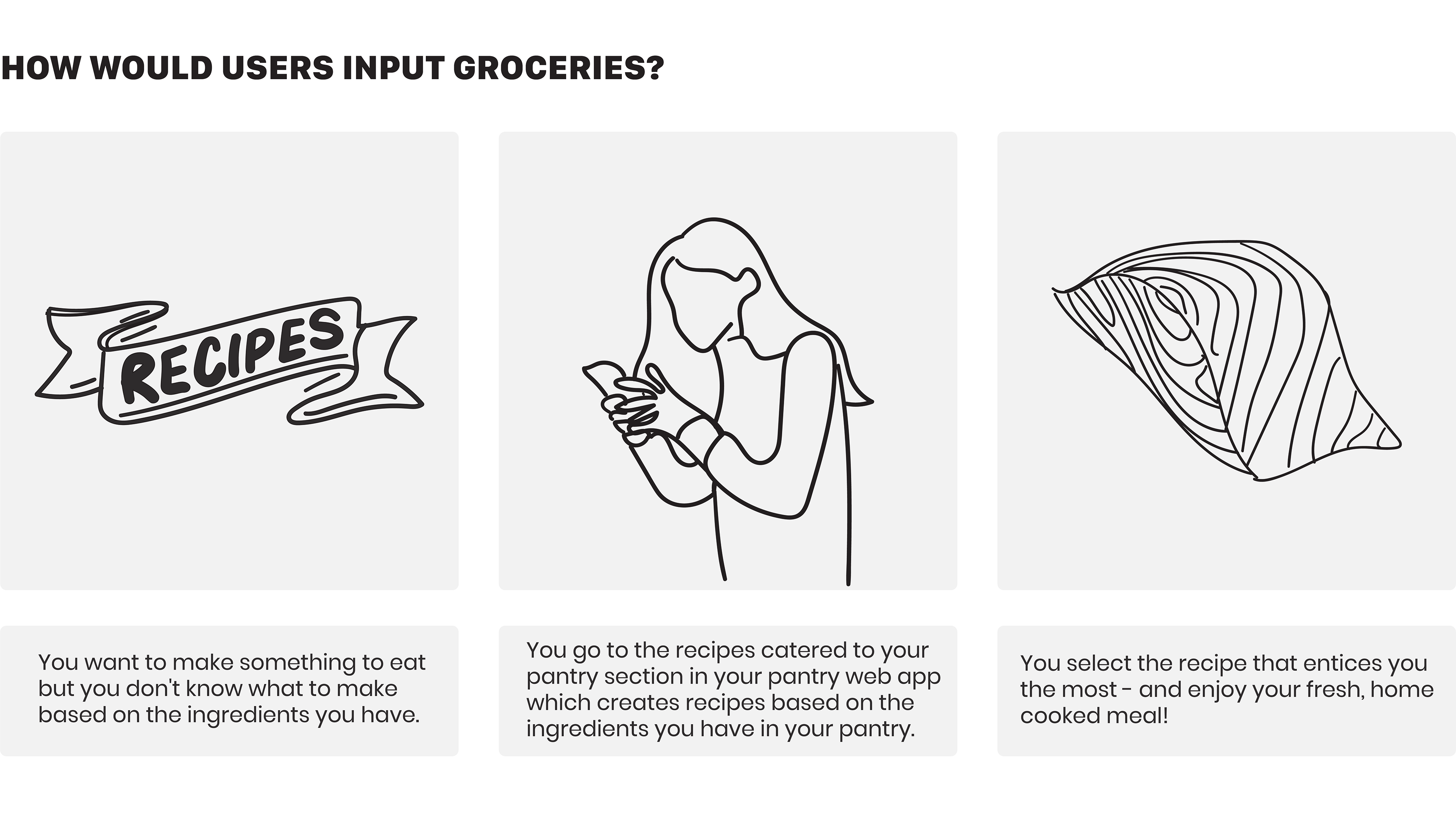
Storyboarding:
Storyboarding helped identify key moments of the users going through different circumstances.
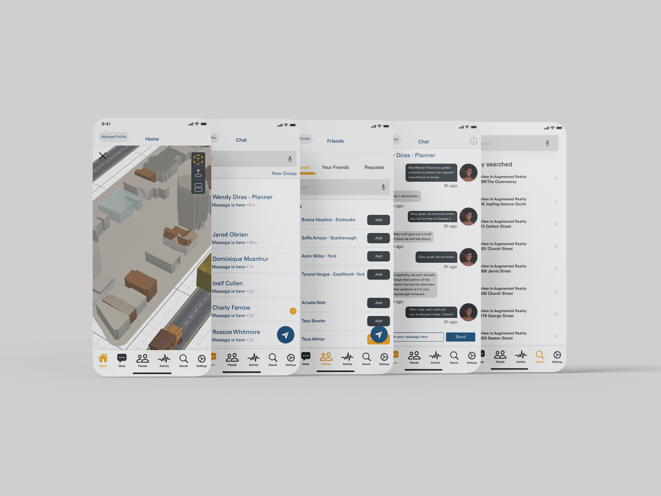
Wireframes, Mockups, and Explanations:
Step by step I made sure to follow my process by starting with wireframes, then creating mockups and prototypes, and lastly making sure there is reasoning for why I made design decisions.
Sketched Wireframes:
In this step of the design process, I was just trying to get some inspiration and I decided on this initial concept in return. This is just a brief sketch that will be taken into Figma for digital wireframes.
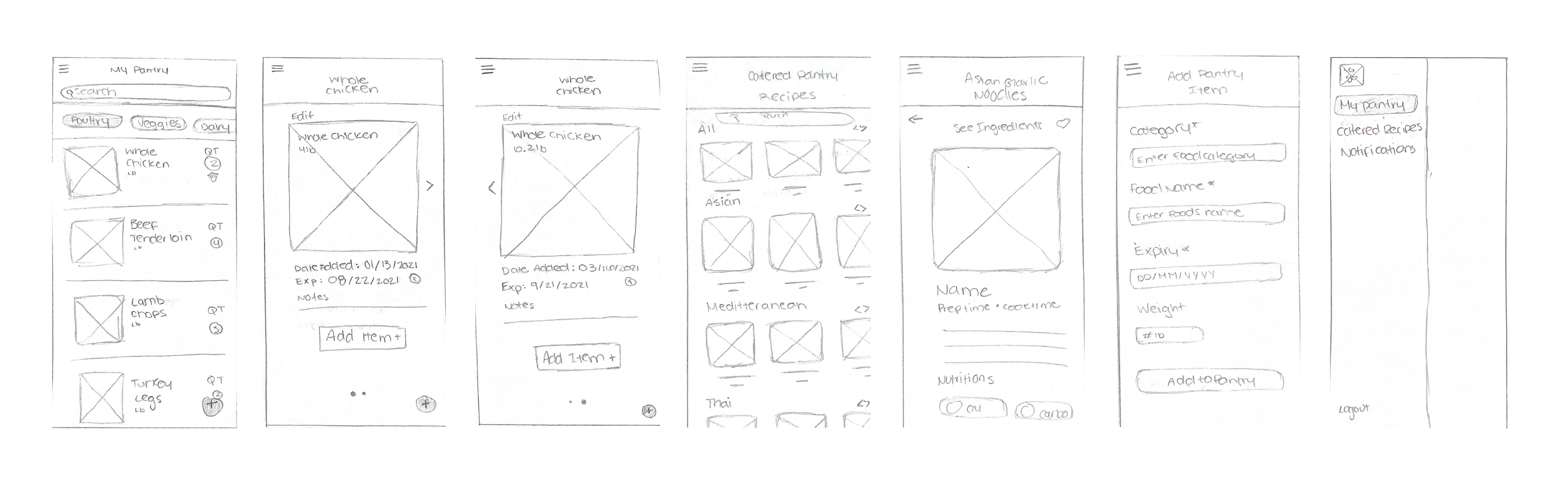
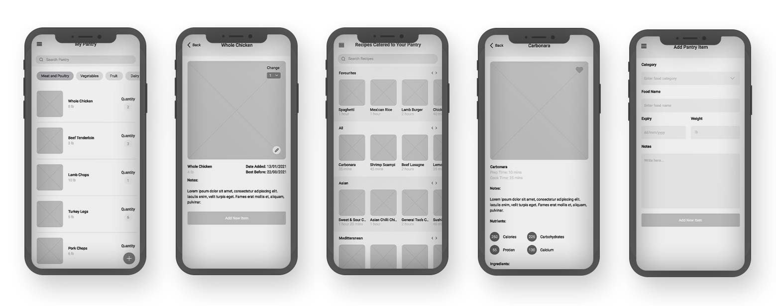
Digital Wireframes:
While it looks pretty similar to the sketches there were very minimal changes done to the digital wireframes such as the structure and adding small elements here and there that helped tie in the experience more.
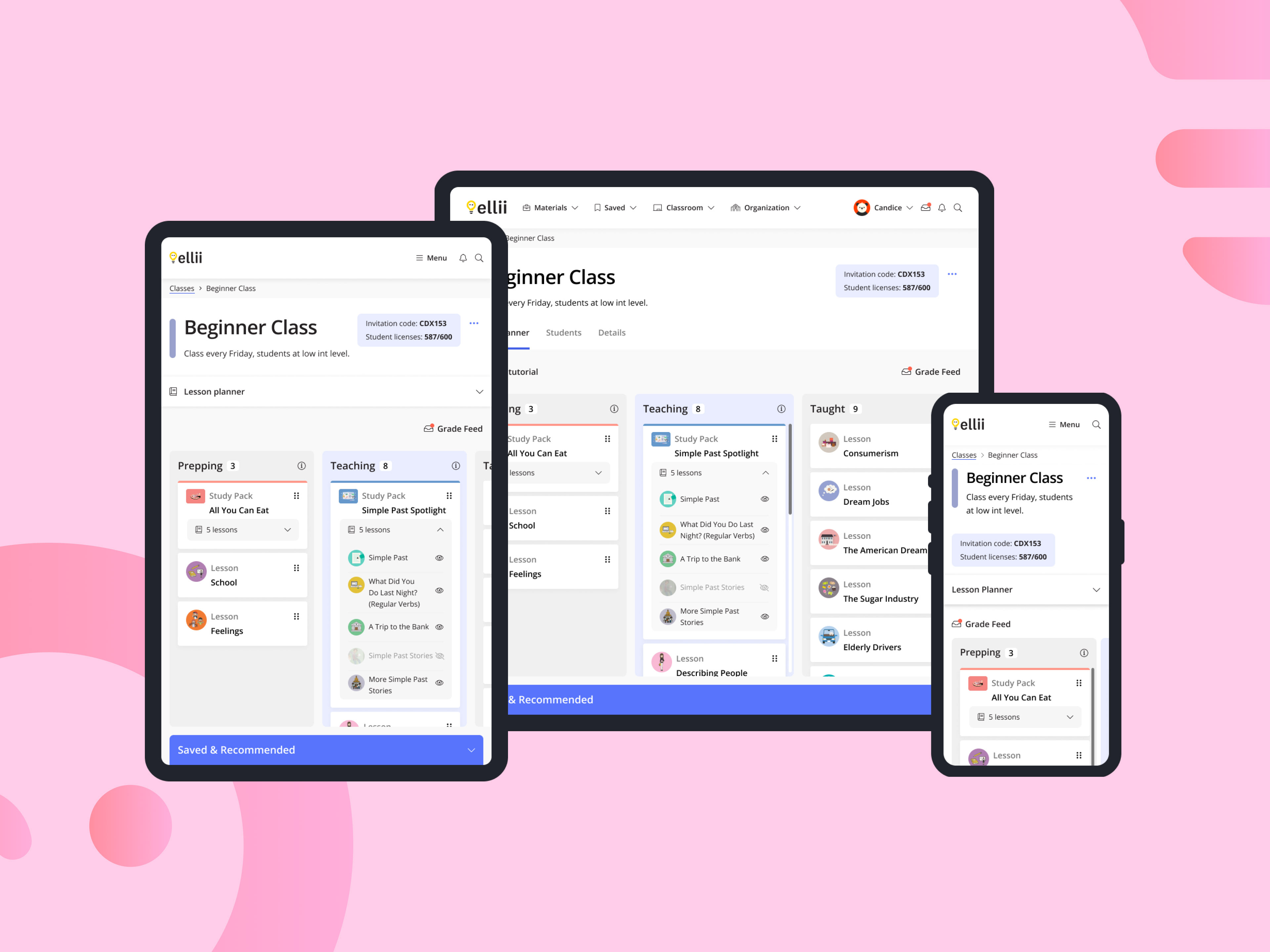
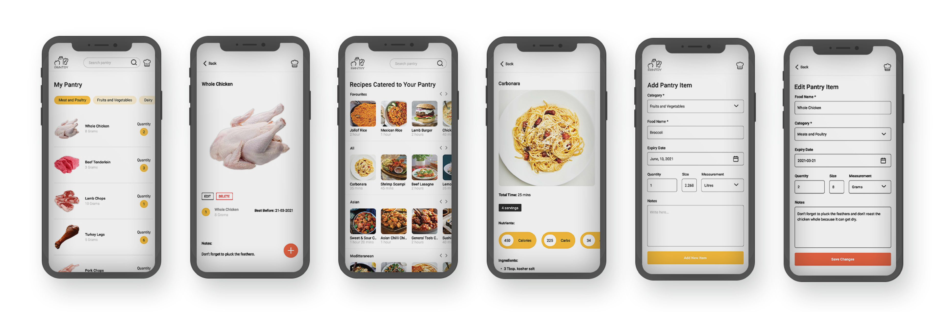
High Fidelity Mockups:
After completing multiple iterations of mockups, I came up with this final high fidelity mockup and prototype.
Explaining Design Decisions:
Explaining design decisions helps show that I am adding value-adding design elements to the web app, and not just throwing features in that are useless to the user's experience.

User Testing and Results:
The user tests interface and functions of the web app, are tested by real users who perform specific tasks in realistic conditions. Here are some of the main tasks I asked the testers to do.
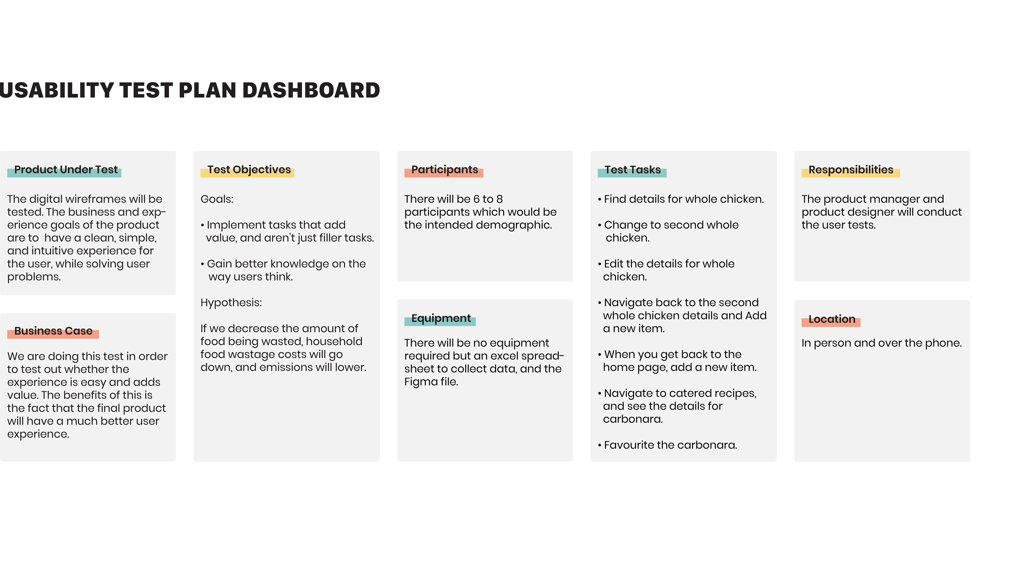
Task 1: Find the details for the whole chicken pantry item
Task 2: Edit the details for the "whole chicken 2" pantry item
Task 3: Navigate to the catered recipes page, and see the details for carbonara
Here are the results to the usability tests I did.
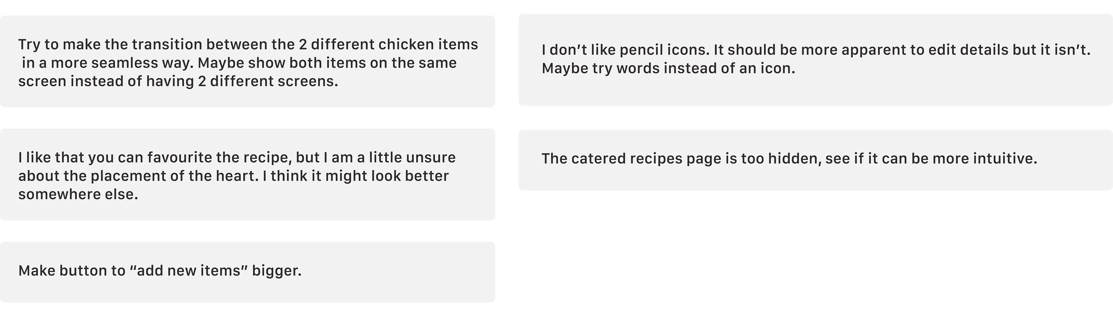
Overall the results showed that users were mainly having issues with icons as well as the positioning of certain elements.
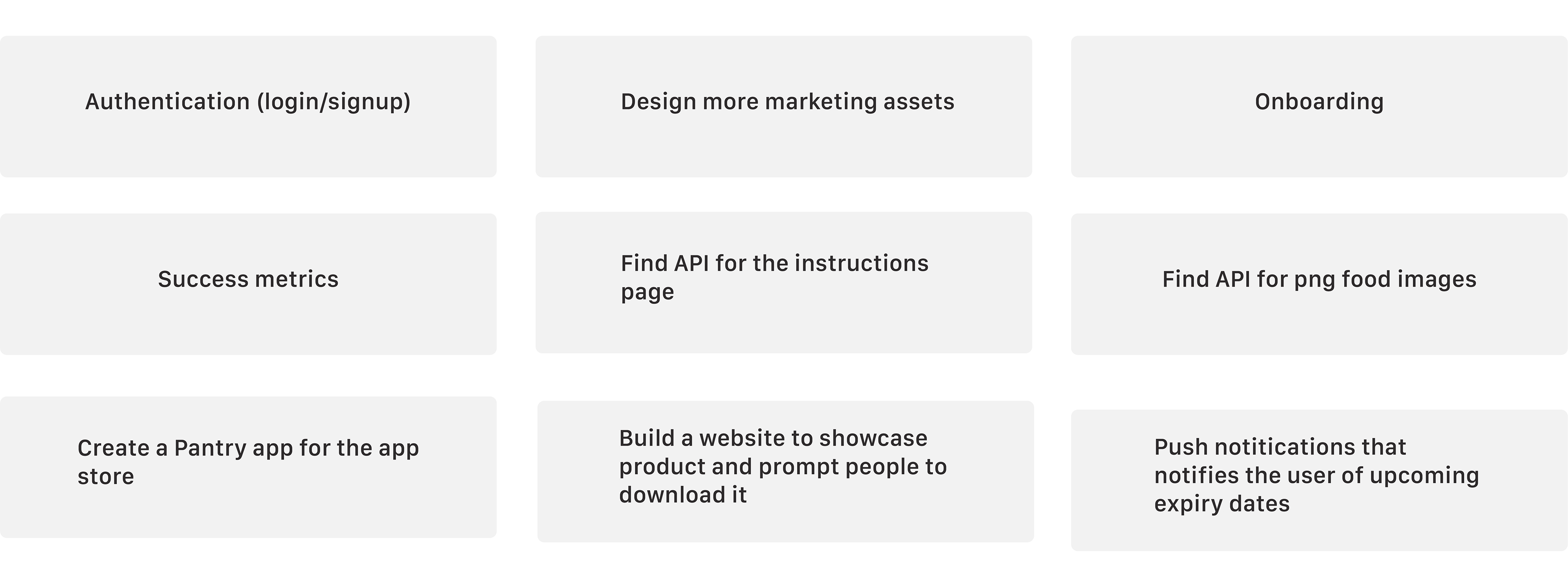
Next Steps:
Final Thoughts:
Reflecting on the work I have done helped me learn from what I had done and develop more as a designer.
What did I learn?
I learned that even if you think the process is going smoothly, in a matter of minutes, you can be behind, and that's okay because problems do arise.
How did I apply it to other work?
• I always make sure to expect challenges and not just a perfect process.
• Things will get resolved no matter how much it seems like it won't.
What would I do differently next time?
I would do a few more iterations on the designs.